andré castelo branco

resume
about
Design System
Client
Role
Timeline
Cleancloud → SEK
Lead designer
2022 → on going
Context
This project started at CleanCloud, that like many startups, faced challenges in developing its technology base, as it did not initially have a structure ready to scale. To get around this situation, the company chose to use third-party frameworks, which ended up causing additional problems when trying to implement more features. This approach required additional effort on the part of the teams and often did not result in satisfactory modifications to existing components and did not reach good levels of system optimization.
Solution
The idea of developing an internal, agile, and modern framework emerged as the company matured in its product journey. Over the years, teams attempted to improve the existing framework but eventually realized that starting from scratch was necessary.
In early 2022, the CleanCloud Design System project was initiated with the goal of building a modular system that could support multiple products, while remaining lightweight and easily adaptable. The main focus was to achieve a high level of optimization, enabling faster, more reliable deliveries and reducing the risk of errors.
Some results after the implementation
Less memory consuption when using the products*
3x
50%
85%
62%
faster teams delivery
less time to prototype new features
less bugs during development
*Using our Cloud Security Posture Management product on google chrome
We joined SEK
Evolution
In 2023, CleanCloud was acquired by SEK, and as a result, the Design System and all the technology used for development would become the company’s standard. It also need to expand to meet the growing demands of a large enterprise, with more specific products and more complex systems.
The Design System would have to support the three languages (Portuguese, English, and Spanish) of the markets where SEK operates, be adaptable for both Cloud and On-Premises systems, and maintain consistency in usability and content across all products.
To achieve this, we had to refactor the entire Design System to address these requirements and build a content system to integrate with it. This changes provided greater flexibility for Product Designers and Content Designers when creating new products, as well as better control over the quality of design deliverables.
Design System
(Typography, Content, Internationalization...)
(Components, Themes, Effects, Icons...)
Content System


Button


Option 1
Option 2
Option 3


Example of how each system was structured and divided
Profile


Cancel
Save

Personal data
Name
Mariana Oliveira
nome@email.com
Email cannot be changed.

Settings
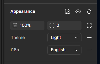
Theme
System

Language
English
Change picture
Home

Technology

SEK
About
People


Action

All formats
CSV
Export
Settings
New
Open
Edit
Save

File
Options


New webhook

Cancel
Create
Enter the url of the webhook
URL
Month
0000


1
8
15
22
29
30
7
14
21
28
29
6
13
20
27
2
9
16
23
30
3
10
17
24
31
4
11
18
25
1
5
12
19
26
2
S
M
T
W
T
F
S

00/00/0000
Away

File Uploader
Upload tables to the platform


Click to upload or drag and drop
SVG, PNG, JPG or GIF (max. 800x400px)

Access denied
You don’t have access to this table. Please, try to contact your admin.


New items
Old items
Any items
Settings
Items may vary depending on the tool used


Add cloud

Search Clouds
Clouds
6
AWS Root
7
AWS Root
0
AWS Root

Search Linkeds
Linkeds
AWS Audit
AWS Dev
AWS Dev
AWS Dev
AWS Dev
AWS Dev


Edit

Remove
Cloud
Vision
All components follow the same pattern of the system of characteristics.
The content area always provides an option for texts created specifically for single use, as well as access to the Content System options for that component.
Component properties panel


Placeholder
Some example of how variables on the Content System are organized for each type of component.
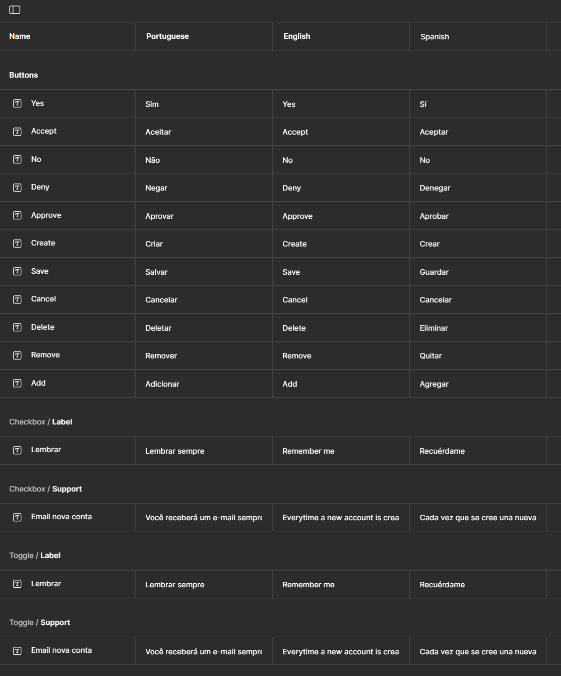

Criar nova conta

Área de conteúdo

Lembrar sempre
Você receberá um e-mail sempre que uma conta for criada
Cancelar
Criar
Create new account
Content area
Remember me
Everytime a new account is created you will receive an email
Cancel
Create
Crear nueva cuenta
Área de contenido
Recuérdame
Cada vez que se cree una nueva cuenta, recibirás un correo electrónico
Cancelar
Crear
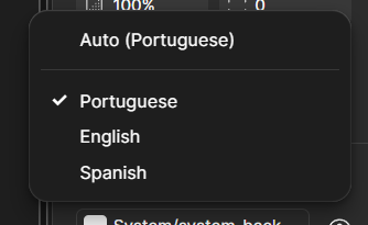
With the internationalization system (i18n) implemented in every component, testing and adjustments due to language changes are done quickly.
Portuguese
English
Spanish
Light
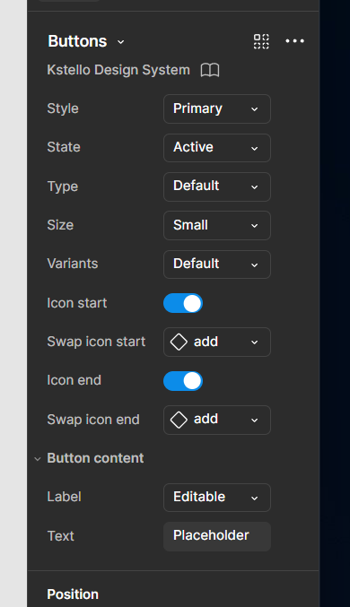
Buttons spreadsheet
Style

Label

Label
Label
Label
Primary
Secondary
Ghost
Danger
State
Label

Label
Active
Disable
Type
Label

Default
Icon
Size
Label
Label
Label
Small
Medium
Large
Variants
Placeholder
Placeholder
Default
Centered
Placeholder
Center expanded
Placeholder
Placeholder
Left expanded
Right expanded
In addition to the Design System documentation, each component has a worksheet to assist designers and developers when consuming the component in Figma.
Accordion
Action bar
Avatar
Breadcrumbs
Buttons
Checkbox
Code snippet
Date picker
Data table
Divider
Dropdown
File uploader
Filter bar
Inputs
Link
Loading
Modal
Navigation
Notifications
Pagination
Progress bar
Progress indicator
Radio button
Scroll
Shortcuts
Tabs
Slider
Tags
Toggle
Tooltips
Token
Use
Value
Color
text-primary-default
Default primary text
Neutral 100
F5F5F5
text-primary-disable
Disable primary text
White
FFFFFF
text-primary-inverted
Inverted primary text
Neutral 200
E5E5E5
text-primary-colorbg
Default primary text for color background
Neutral 200
E5E5E5
text-secondary-default
Default secondary text
Neutral 200
E5E5E5
text-secondary-disable
Disable secondary text
Neutral 200
E5E5E5
text-secondary-inverted
Inverted secondary text
Neutral 200
E5E5E5
Example of typography tokens used in themes

Stockholm
eu-north-1
Access


Region items
Exposed items
2018
Total
Failed
6059
High
Medium
Low
202 items failed of 1840 items analyzed
61 items failed of 2039 items analyzed
1755 items failed of 1755 items analyzed
11%
3%
86%

Stockholm
eu-north-1
Access


Region items
Exposed items
2018
Total
Failed
6059
High
Medium
Low
202 items failed of 1840 items analyzed
61 items failed of 2039 items analyzed
1755 items failed of 1755 items analyzed
11%
3%
86%
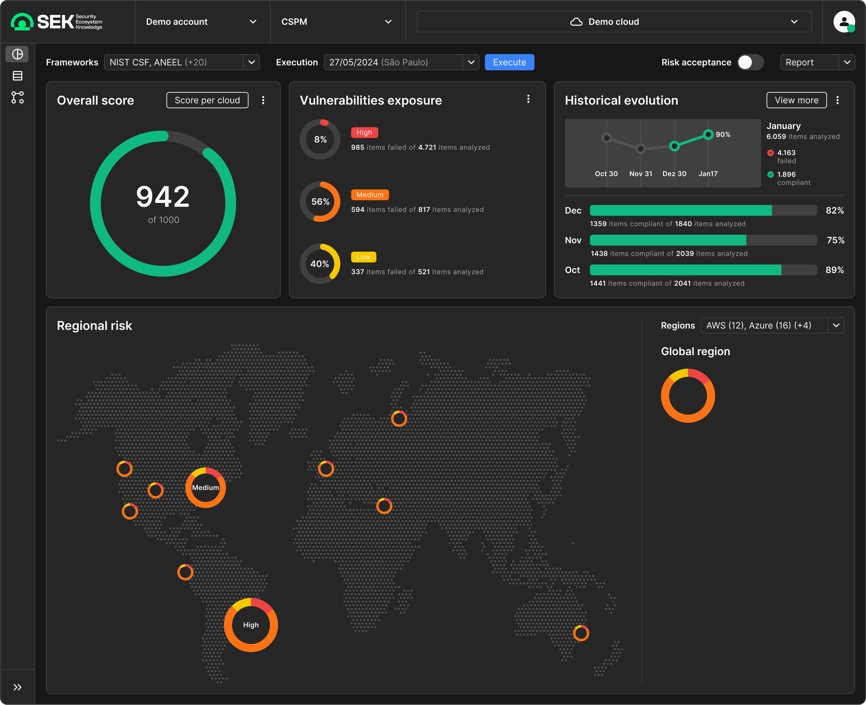
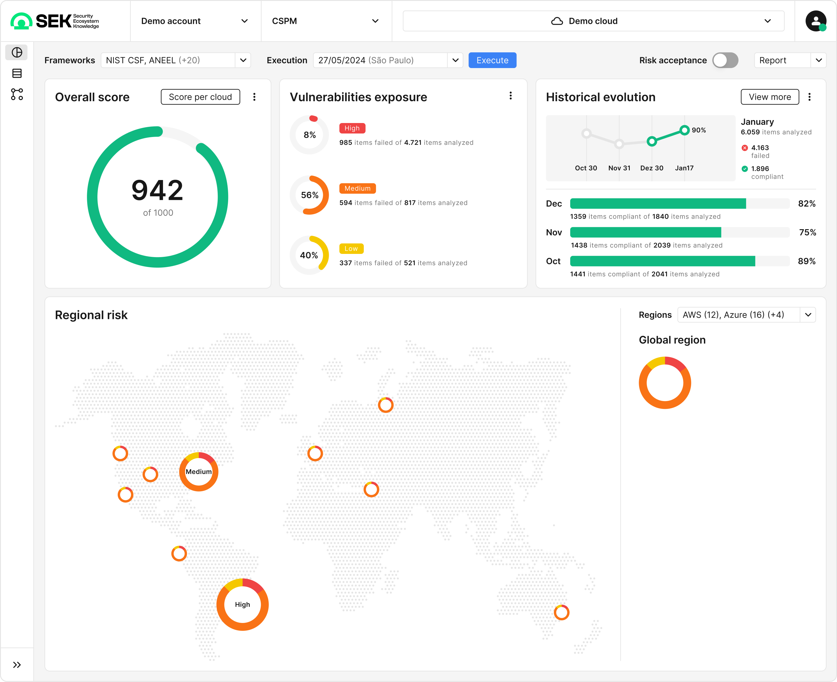
Cloud Security Posture Management using the dark theme